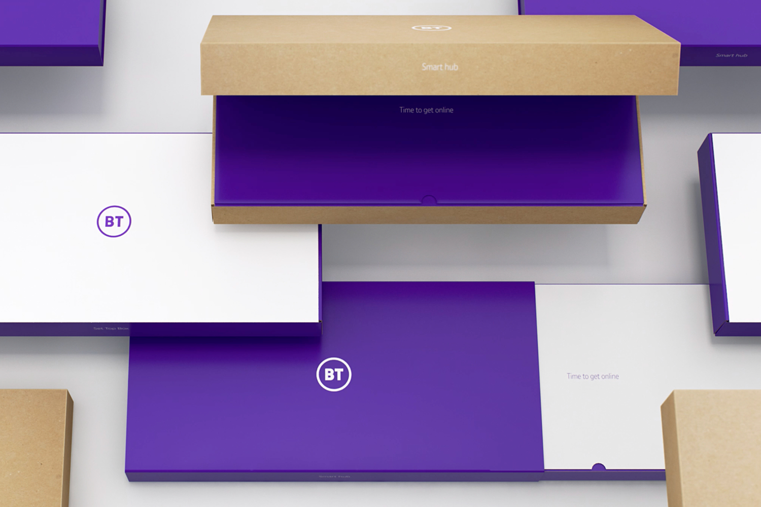
As a world-leading technology business, BT needed a brand identity that was able to support their future ambitions and help shake off perceptions of an old style utility.
Designed at Red&White / Photography by David Burton, Brian Walker, Lulu Ash
BT operate across a huge range of fields; from sports broadcasting to connecting global businesses; leading the way in cyber security innovation to creating products and services for homes and businesses.
Their previous brand identity had become chaotic, complicated and disparate. A simplified set of core visual components was developed to allow the brand to evolve with the business, while preserving recognition as the organisation grows.
As part of the shift in the business, BT focused on a more personal approach to both consumer and wholesale through every touch-point.
Every part of BT’s identity was updated and re-built, so that each element fits together as part of an easy-to-manage and efficient visual system.


